
What is mobile design?
Most commonly known as a design strategy, the Mobile design is also called “mobile-first design,” is all about developing a responsive product design for your website or app to deliver user-friendly experience to mobile users. To say more, it is about starting to develop the product design from the smaller screen of mobile to have it interface to fit in it correctly, and later on the move to the bigger screens of laptops and tablets.
However, appealing interface and easy navigation are the two standouts to resist your app in the saturated market.
Evolution and history of mobile designs
Overviewing the competitive app stores, there are more than 1,000 apps making their way into the world of mobile apps. However, digging out the history, it can be easily observed that it all started back in 2008, when Steve Job first launched the app store.
Initially, the launched apps were based on skeuomorphism, replicating the designs as the original counterparts. Taking the example of the apple newsstand, at first, it looked like a real-life newspaper shelf. The idea behind was to emulate real life.
Facebook, another popular App that was launched in the same year, first had a 3D design with raised sidebars and button, aimed to give users the same feel of motion and pushing the button.
Initiating from the concept of 3D ad skeuomorphism, mobile designs have traveled a long way, and are now typically flat. Flat designs are based on a two-dimensional approach, focusing specifically on user experience and functionality. However, it was later edited and enhanced with Google’s design guidelines announced back in 2014. Later on, the once skeuomorphism mobile app design transformed into a flat design with the effects of transition, shadows, lighting, and animation as per Google’s guidelines.
The world is expecting the addition of new screen sizes as the next innovations in the mobile designs, however keeping the minimalism in place.
Statistics of mobile device adoption
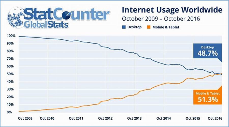
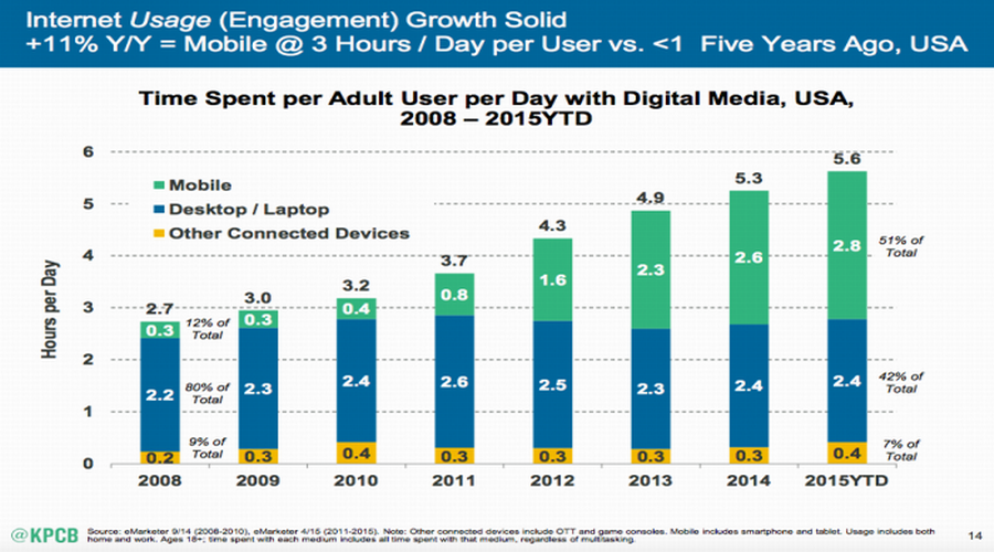
80% of users used a mobile device to search the internet in 2019
● 40% of online transactions are done using a mobile device
● US mobile search ad spending was estimated at 28.12 Billion in 2019
● More than 50% of websites are using responsive web design technologies that
work for all devices
● More than 3/4 shoppers use mobile devices along with physical shopping
● By the end of 2019, mobile advertising will account for 72% of all U.S. digital
ad spending
● Nearly half of users read reviews of all purchases on their mobile phones
● Website speed is important for more than half of the mobile users
● Nearly half of mobile users switch to your competitor instead, after a bad
experience with your mobile site
● 3 out of 4 teens regularly make purchases online now.
Adaptive vs. Responsive mobile design
Comparing the two, the responsive mobile design is defined as the one that provides an ideal view of the website/app on different screen sizes. Ranging from the smallest mobile screens to tablets and even laptops, responsive mobile design allows the user to navigate through the app with zero to minimum scrolling, zooming, and panning.
Contrary to this, the counterpart is advanced with different layout sizes to fit on different sized screens. For instance, the adaptive mobile design is built with a layout for a mobile screen, tablet screen, and laptop screen.
Being more flexible for all types of screens, responsive mobile design is recommended to be best to retain the quality and top-notch user experience for your app.
Search Engines Penalty for not being mobile-friendly
Google owns an algorithm to classify two types of sites; mobile-friendly and mobile-unfriendly. The only purpose behind is to detect the ones that are unfriendly and penalize them for the lacking. However, not to mention, this penalty is not at all monetary like others. Instead, it works for the ranking on google search. The non-friendly ones are penalized with traffic reduction penalty leading to dropped SEO ranking in mobile search pages.
To figure it out, you can easily check the status of your website being friendly or not here at (https://search.google.com/test/mobile-friendly).
Conclusion

So, if you are the one wandering out to have professional assistance to come up with a kick-ass website/app for your business, look no further than the Black Tiger Creative. We are capable of complementing your digital presence with everything fancy to make the user’s experience worth a while. Browse to our mobile design page for more information.